

|
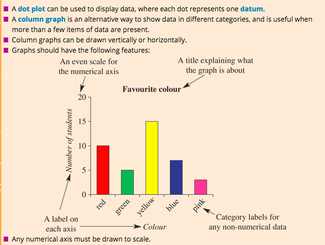
Types of Graphs:
|
Which graph to use:
|

|
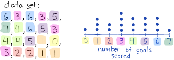
Dot Plot and Column Graph!
Graphs to display categorical or numerical discrete data.
Dot Plot
Dot Plots are a quick way to visually represent data.
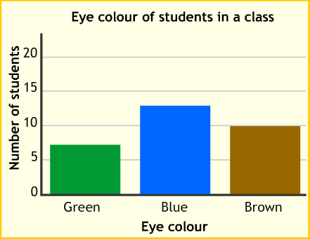
Column Graph
The data is typically categorical.
|
|
Section 8C:
Q1-4 Alternate
Q5
Q6 a or b
Q7
Q9

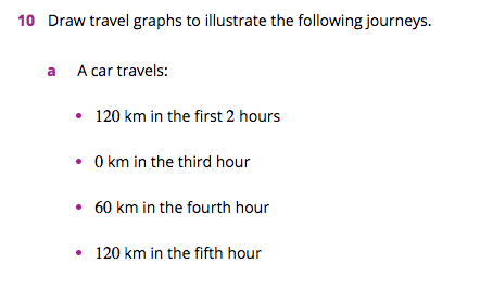
Line Graph!
Graphs to display numerical continuous data.
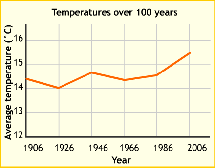
Line Graph
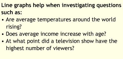
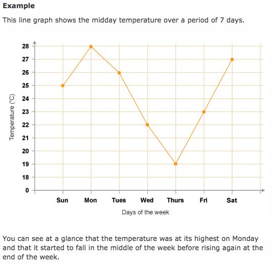
A line graph is useful for showing trends in data that change over time.
|
|

|
|
Textbook:
Section 8D
Q1
Q2
Q3
Q5
Q7
Q8

Textbook:
Section 8D
Q3
Q5
Q6
Q8
Q10b
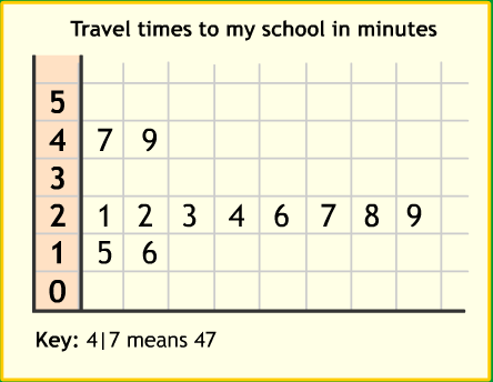
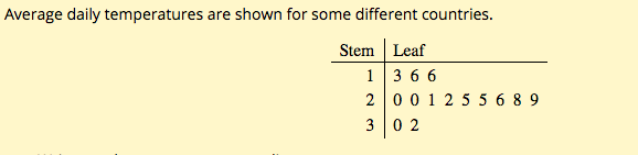
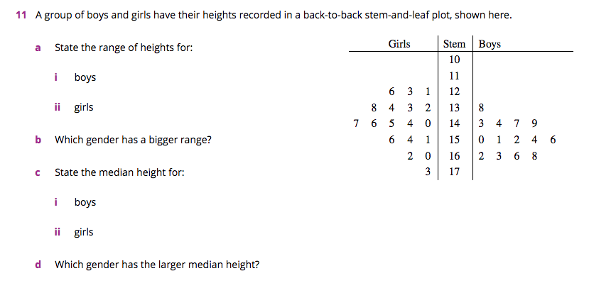
Stem and Leaf Plot!

|
|
Graphs to display numerical discrete and continuous data.
Stem and Leaf Plot
A Stem and Leaf Plot is a special table where each data value is split into a "stem" (the first digit or digits) and a "leaf" (the last digit). They are useful for organising data and showing the frequency with which certain classes of values occur.

|

|

|
|
Textbook:
Section 8E
Q1-5
Q6 alternate
Q8 – please let Miss J know when you are up to Q8
Q9
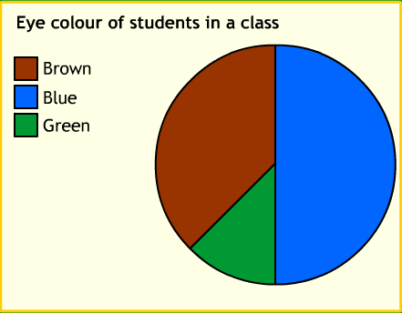
Pie Graph!
Graphs to display categorical data.
Pie Graph
A Pie Graph (Chart) is a useful visual way to display categorical data. Pie Charts are best to use when you are trying to compare parts of a whole.
This type of chart is a circle divided into a series of segments. Each segment (slice) represents a particular category.
This type of chart is a circle divided into a series of segments. Each segment (slice) represents a particular category.

|
|
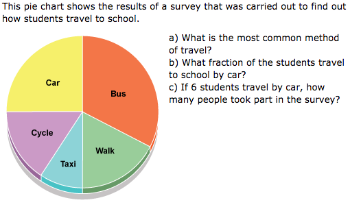
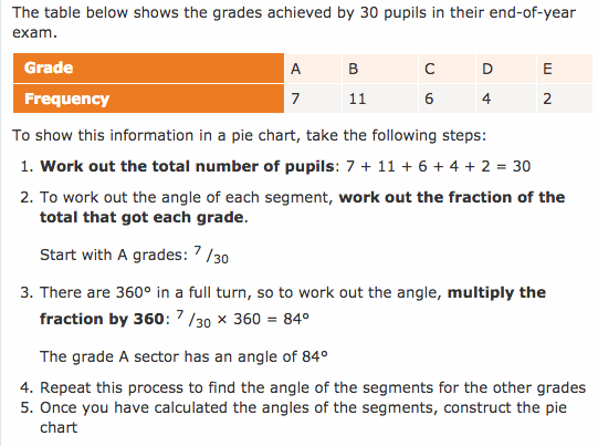
Textbook:
Section 8F
Q1-3
Q6-9

