Histograms are like bar charts but the bars can have different widths…and the area of the bar shows the frequency…sounds confusing right? Don’t worry we’ll look at some examples in a second and it will make sense…but before that there is a couple of things you need to know:
On a histogram the y axis always shows something called “frequency density”.
Frequency Density = Frequency / Class Width
You can also rearrange this to work out how much each bar represents.
Frequency = Frequency Density x Class Width
And this equals the area of the bar!
If you’re going to draw a histogram you first need to find the class boundaries and class widths.
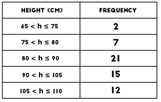
Example: The table below shows the heights of children in a class. Draw a histogram based on the data.
On a histogram the y axis always shows something called “frequency density”.
Frequency Density = Frequency / Class Width
You can also rearrange this to work out how much each bar represents.
Frequency = Frequency Density x Class Width
And this equals the area of the bar!
If you’re going to draw a histogram you first need to find the class boundaries and class widths.
Example: The table below shows the heights of children in a class. Draw a histogram based on the data.
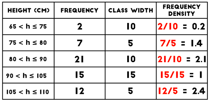
First add columns with class width and frequency density to the table.
Now you can draw your histogram.
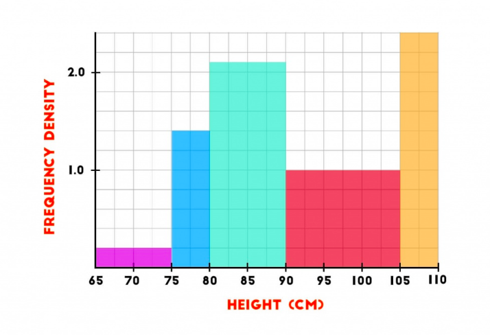
Note: In an exam you might just be given a histogram like this and asked, for example, how many children are between 80cm and 90cm. All you would need to do it work out the area of the bar between these values:
area = frequency density x class width = 2.1 x 10 = 21 children
area = frequency density x class width = 2.1 x 10 = 21 children
